Linked Production: Print
1) Confirm your production brief.
To create a billboard for a mental health awareness campaign.
2) Research: detailed notes on at least THREE texts similar to what you are creating. What are the key conventions? What can you learn/borrow from the examples you have looked at?
2) Research: detailed notes on at least THREE texts similar to what you are creating. What are the key conventions? What can you learn/borrow from the examples you have looked at?

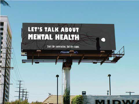
This billboard uses contrasting colours such as black and white to make the text stand out- an important convention for a billboard advertisement. The words "lets talk about mental health" gets straight to the point and is memorable to the viewer. It engages with them by instructing the to speak on the issue. This is quite similar to my idea for a billboard advertisement as I am also exploring mental health and how it is important to talk about the issue- especially for the victims. This will also link to my video production(which is a 40 second advert) as it explores the idea of talking to someone about problems that you go through. The billboard also includes the phrase "Start the conversation. End the stigma", which is quite similar to the message that I intend to explore for my productions. I think command words like "start" are important, especially in print productions, as they directly target the viewer and force them to act on the campaign.

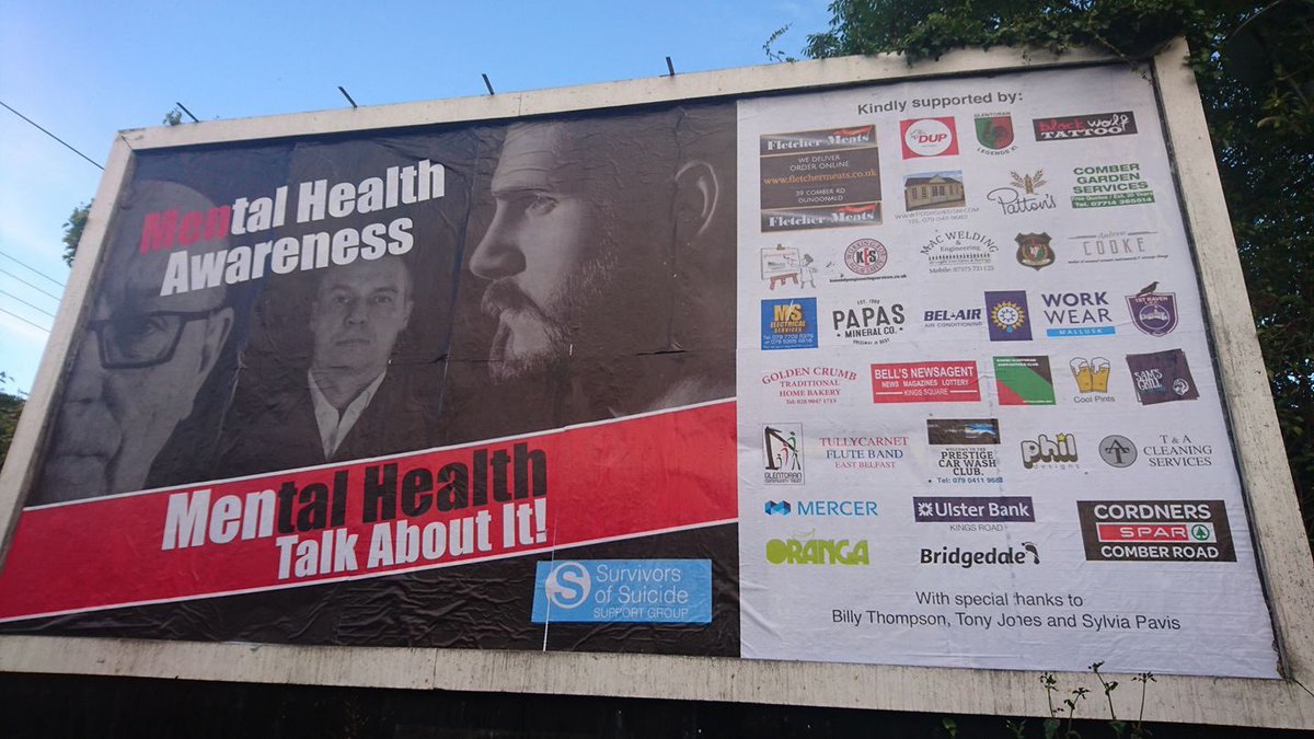
This billboard plays with the words "mental health" as it highlights the word "men" in "mental health" in red. This allows it to make its target demographic clear. For my mental health awareness campaign (my video production) I decided to target a fairly young demographic as I believe that mental health issues are becoming more of a problem for young people. I also believe that there are not enough campaigns targeting this particular demographic as teen mental health issues are usually seen as teen angst. This is why I believe it is important to use this campaign to target a young audience as it allows people to talk more openly about the issue and in turn help those who are suffering from mental health issues. The images included in the advert are taken at different angles e.g side profiles, close up shots, medium close ups. The billboard also uses a dark background to highlight the seriousness of the issue and also make the text stand out. This is quite similar to my idea for my billboard as I am also using side profiles of my characters and placing them against a dark/ blurred background, so that the text in front stands out.
This advert uses iconography from text messages to appeal to a large demographic. I think this is quite effective as it is easily recognisable by those who walk by and therefore fulfils its aims as it attracts the viewers attention. The advert also reads "On January 25, lets talk", which is short and simple and memorable to the viewer. I think that by including a day which falls on "Mental health awareness week", it allows viewers to look up the day and see how they can get involved in the campaign and help mental health organisations reach out to those in need. The simple phrase "lets talk" is also quite effective- especially in the text message format- and also targets a young demographic as it is talking to them in a way that they would understand. The woman featured on the advert is also smiling which makes the campaign seem hopeful and life changing as it ensures those in need that they will change their lives, just by talking to someone. This is quite similar to my advert as I also explore the need to talk about mental health problems. I also intend to use a short and simple phrase that is quite memorable.
5) Sketching and drafting - for video-based productions this means astoryboard - sheets available in DF07 or you can print out your own AQA storyboard sheet. For print productions, this means detailed sketches of all your pages.
The word "somebody"- "body" will be written in red text- highlighting the fact that you have to talk to a real person about your problems. The text will be written across and it positioned so that the text goes over the teddy bear's head- links to the phrase "going over your head" which is when someone doesn't understand what your saying. This then suggests that whatever the mental health victim said to the teddy bear is pointless as it is not real.
The iconography is also taken from my first video production and therefore creates synergy with both print and online/broadcast platforms. The viewers will recognise the characters from the original advert which will therefore connect all the ads for the mental health campaign together.
6) Shot list - use Microsoft Word or a template like this to help you. Remember, you need a shot list whether you are filming or carrying out a print photoshoot - professional quality original images are essential if you want to reach the top level.
Shot No.
|
Shot Type
|
Details of Shot
| |
1
|
Side angle shot- medium close up
|
Pratisha is looking straight ahead. Her face looking worried (to the right)
| |
2
|
Side angle shot- close up
| Teddy Bear looking straight ahead (to the left) |


Comments
Post a Comment